-Analyse the Forbes 2000 Global Companies dataset -Determine if the number of employees in a company is related to the revenue.
This is a webscrapped dataset containing Top 2000 Companies which are ranked by by using four metrics which are their sales, profits, assets, and market value. It has the 11 columns of data and they are: 2022 Ranking : Organization's Current Year Ranking Organization Name : Name of the Organization Industry : The industry type the Organization mainly deals with. Country : Country of Origin Year Founded : Year in which the Organization Founded CEO : CEO of the Organization Revenue (Billions) : Revenue made in the current year Profits (Billions) : Profits made in the current year Assets (Billions) : Assets made in the current year Market Value (Billions) : Market Value as in current year Total Employees : Total Number of working employees Note: There are few 0 values in the "Total Employees" column , which means those data were not shown in the Forbes List or which is not disclosed by the company or in the website. Link to dataset : https://www.kaggle.com/datasets/rakkesharv/forbes-2000-global-companies
Import csv file and include all neccessary libraries:
import pandas as pd
import matplotlib.pyplot as plt
import numpy as np
import seaborn as sns
import random
from scipy import stats
import statsmodels.formula.api as smf

Forbes_data = pd.read_csv("Forbes_2000.csv", sep=",",header=0)
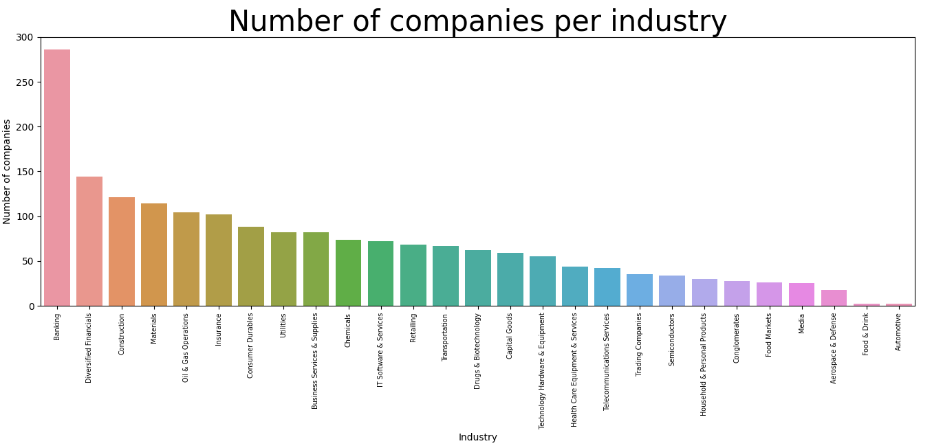
bar chart showing number of companies in each industry using seabon:
plt.figure(figsize=(15,15))
sns.countplot(data=Forbes_data, x="Industry", order=Forbes_data['Industry'].value_counts().index)
plt.tight_layout()
plt.xticks(rotation=90, fontsize = 'x-small')
plt.ylabel("Number of companies", fontsize=10)
plt.xlabel("Industry", fontsize=10)
plt.title("Number of companies per industry", fontsize=30)
plt.show()
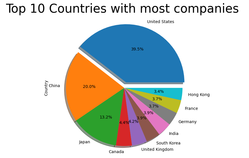
Pie chart showing the percentage of the top 10 most occuring countries:
Forbes_data['Country'].value_counts()[:10].plot(kind = 'pie' , autopct = '%1.1f%%' , shadow = True , explode = [0.1,0,0,0,0,0,0,0,0,0])
plt.title('Top 10 Countries with most companies ', fontsize=30)
fig = plt.gcf()
fig.set_size_inches(7,7)
plt.show()
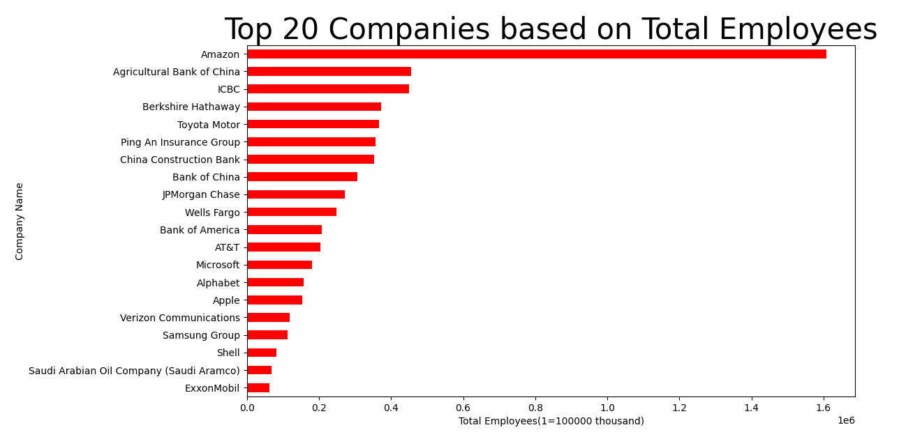
visualize top 20 of company name based on total employees:
plt.figure(figsize = (15,5))
Forbes_data.groupby(company_top20)['Total Employees'].sum().sort_values(ascending = True).plot(kind = 'barh', color = 'red')
plt.title('Top 20 Companies based on Total Employees', fontsize = 30)
plt.xlabel('Total Employees(1=100000 thousand)', fontsize = 10)
plt.ylabel('Company Name', fontsize = 10)
plt.show()
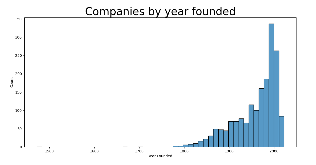
Number of companies based on when they were founded, seaborn histogram, first remove rows with 0 values, i.e where Forbes_data['Year Founded'] == 0:
Forbes_data = Forbes_data.loc[~(Forbes_data['Year Founded'] == 0)]
plt.figure(figsize = (15,15))
sns.histplot(data = Forbes_data, x = 'Year Founded')
plt.title('Companies by year founded',fontsize=30)
plt.show()
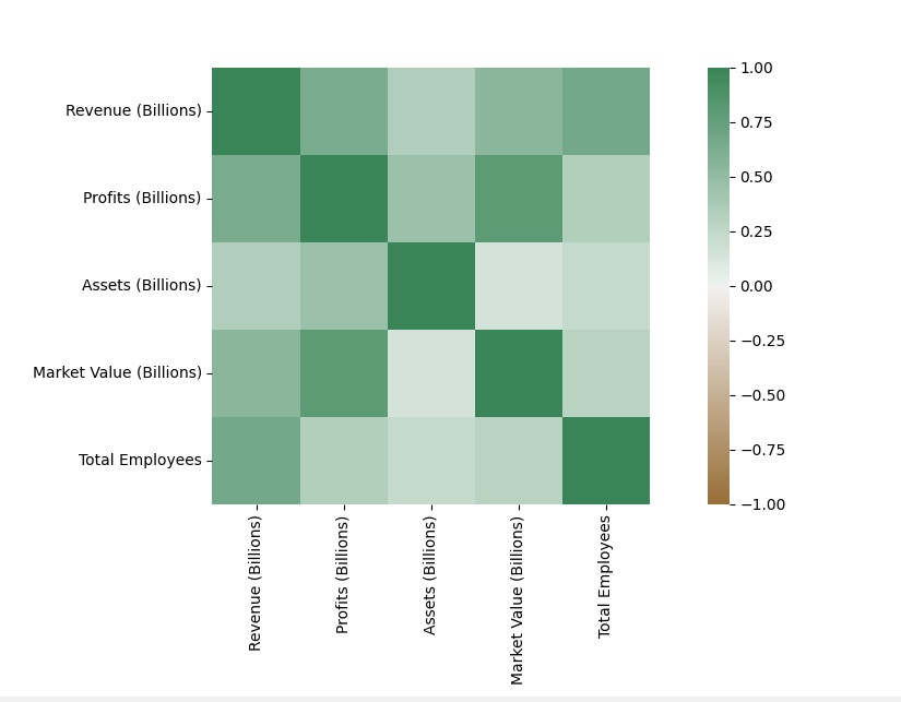
correlation matrix:
correlation_matrix=Forbes_data[['Revenue (Billions)','Profits (Billions)','Assets (Billions)','Market Value (Billions)','Total Employees']];

correlation_matrix = correlation_matrix.corr()

axis_corr = sns.heatmap(
correlation_matrix,
vmin=-1, vmax=1, center=0,
cmap=sns.diverging_palette(50, 500, n=500),
square=True
)
plt.show()
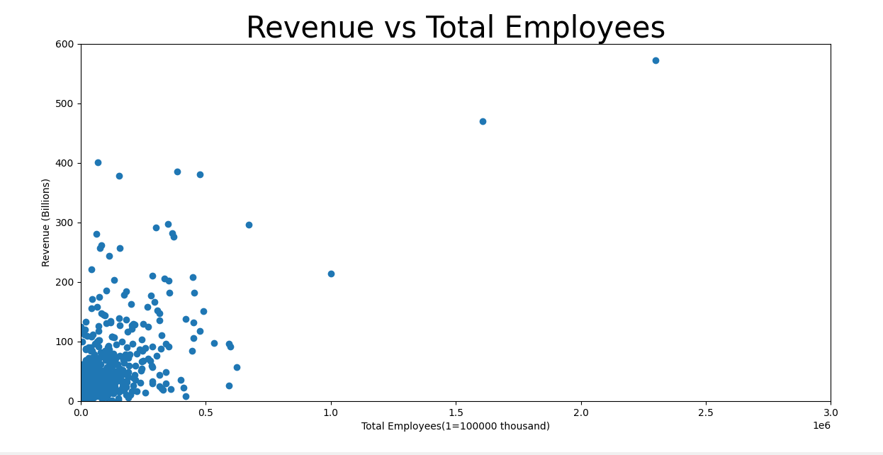
Linear Regression scatterplot:
x = Forbes_data['Total Employees']
y = Forbes_data['Revenue (Billions)']

slope, intercept, r, p, std_err = stats.linregress(x, y)

def myfunc(x):
 return slope * x + intercept

mymodel = list(map(myfunc, x))

plt.scatter(x, y)
plt.plot(x, mymodel)
plt.ylim(ymin=0, ymax=600)
plt.xlim(xmin=0, xmax=3000000)
plt.title("Revenue vs Total Employees",fontsize=30)
plt.xlabel("Total Employees(1=100000 thousand)")
plt.ylabel ("Revenue (Billions)")
plt.show()
Correlation:
print(np.corrcoef(correlation_matrix['Revenue (Billions)'], correlation_matrix['Total Employees'])[0,1])
Regression Table:
Forbes_data.rename(columns = {'Total Employees':'TotalEmployees', 'Revenue (Billions)':'Revenue'}, inplace = True)

model = smf.ols('Revenue ~ TotalEmployees', data = Forbes_data)
results = model.fit()
print(results.summary())
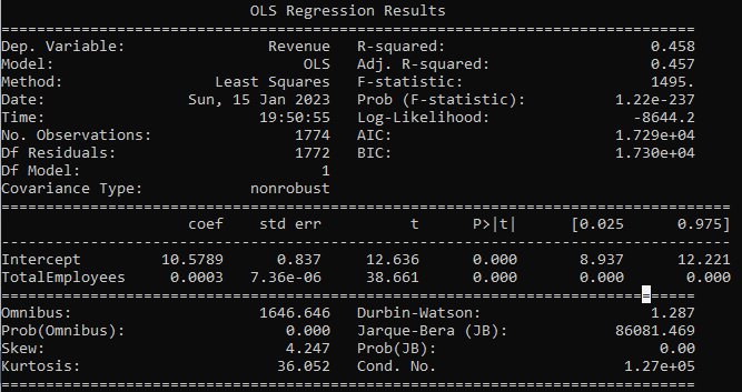
How can we summarize the linear regression function with Total Employees as explanatory variable? -Coefficient of 0.0003, which means that Total Employees has a very small effect on Revenue. -P-value is equal to zero (no relationship) between Total Employees and Revenue. -R-Squared value of 0.457, which means that the linear regression function line does fit the data well.